
These 9 design mistakes make an entrepreneur/influencer lose potential clients, and followers. Every person who plans to be an entrepreneur, influencer, or market agent of any kind will have to learn the basics of design. These mistakes are killing your marketing.
1. Readability
If it’s slightly difficult, people don’t do it. Readability is the most important aspect of design. If people struggle to read or understand a design, they ignore it. A lot of entrepreneurs/influencers do whatever it takes to make their design look amazing, ignoring its readability. A person being able to read the product, service, or value that you’re offering is what makes them decide if they’re going to become a client/follower or not. Capturing a person’s attention with an amazing design is great, but failing to hold their attention and turn them into a client or follower using your design, what’s the point in even trying to get their attention in the first place.
Don’t sacrifice readability for a “cool look”.

2. Not Enough or Too Many Visuals
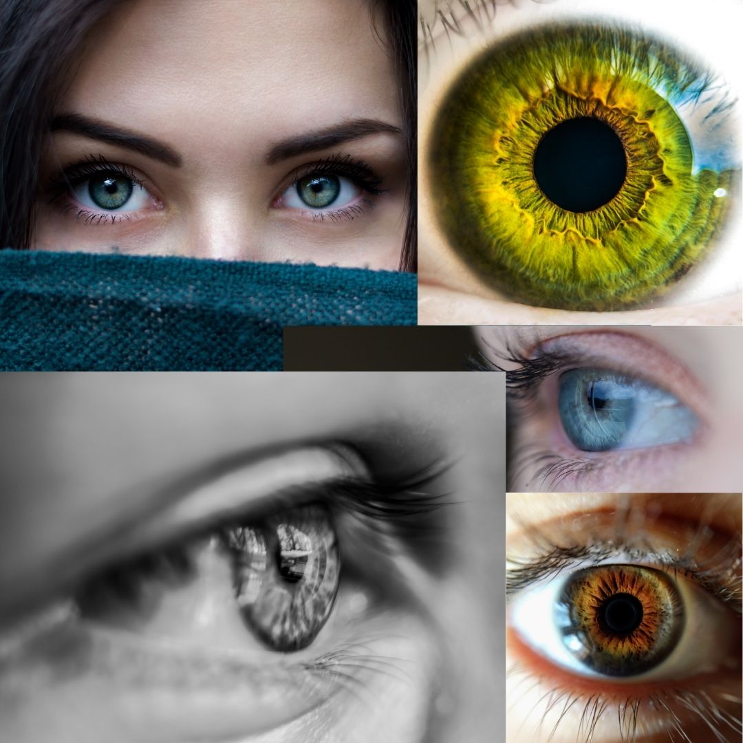
Humans are visual creatures. If a person clicks on a website with no visuals, they leave. The same goes for brochures, flyers, and so forth. Visuals are what attracts people’s attention and make them stay. Use visuals instead of words where possible; don’t describe your work, show it. Use as few words as possible to get your message across. Ensure your visuals are high-quality; crappy visuals that are blurry or pixelated will make people leave.
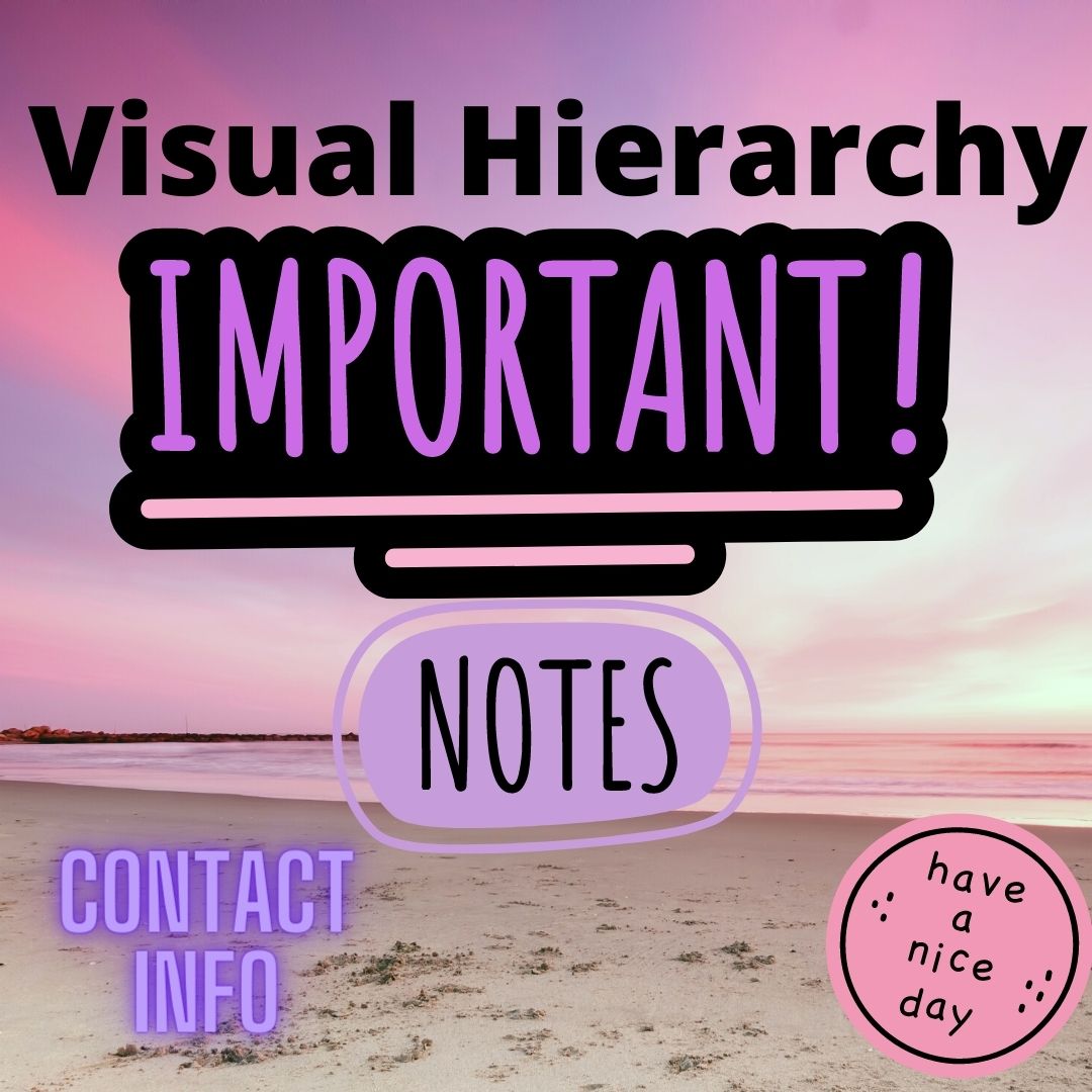
Keep in mind the layout of your design. Do not cram in as many visuals as possible, and ignore visual hierarchy. The most important visuals, and words, are bigger. Keep it neat, keep it clean.
3. Lack of White Space
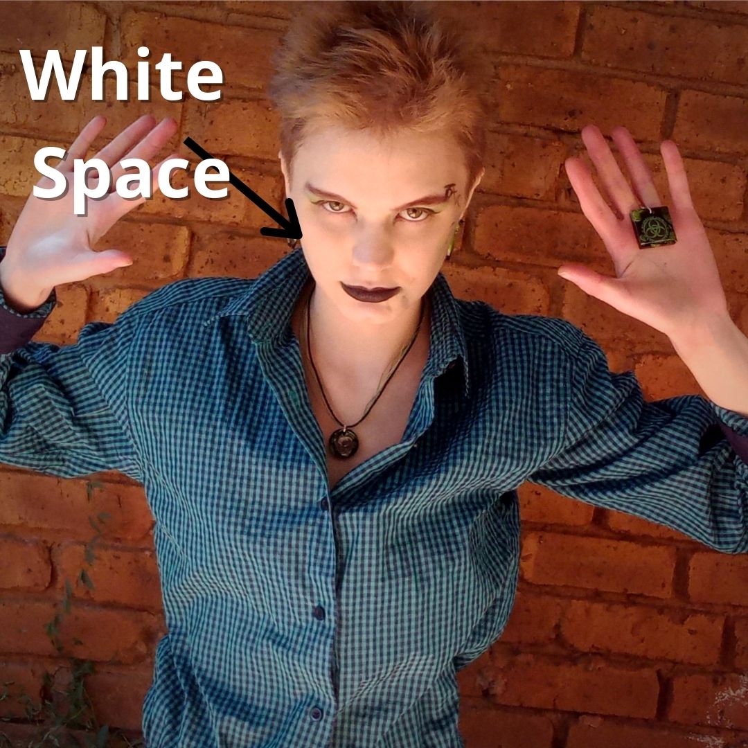
Think of designing the same way as applying makeup. You don’t want to cover your entire face with every color you have, you need spaces that seem like there is nothing there. White space is also called negative space. White space is not necessarily empty. For example, the areas where you have nothing but foundation is the white space on your face. Contouring enhance the design that is your face, then the lipstick and eyeshadow are the elements of your design. Using makeup you can look cute, terrifying, natural, gothic, and so on. Makeup on someone’s face is a beautiful example of how you should approach designing as a whole.
4.Lack of Purpose
Keep in mind what the message of the design is. If you’re a jewellery shop, have visuals of your jewellery and people wearing it. DO NOT put images of random pretty people wearing cool-looking jewellery that doesn’t relate to your shop. A design should capture a person’s interest, and if they like what you are making, they may decide to follow you on social media and buy from your shop.
If you primarily make cute plushies, do not make your design dark and gothic. Keep in mind the audience you want to attract. Should this design attract gothic adults, or should it attract children? Should the design attract people who like making jewellery, or should it attract people who like wearing jewellery? Who are you trying to attract?
Always keep the subject matter and target audience in mind; do not create without purpose.
5.Too Many Fonts
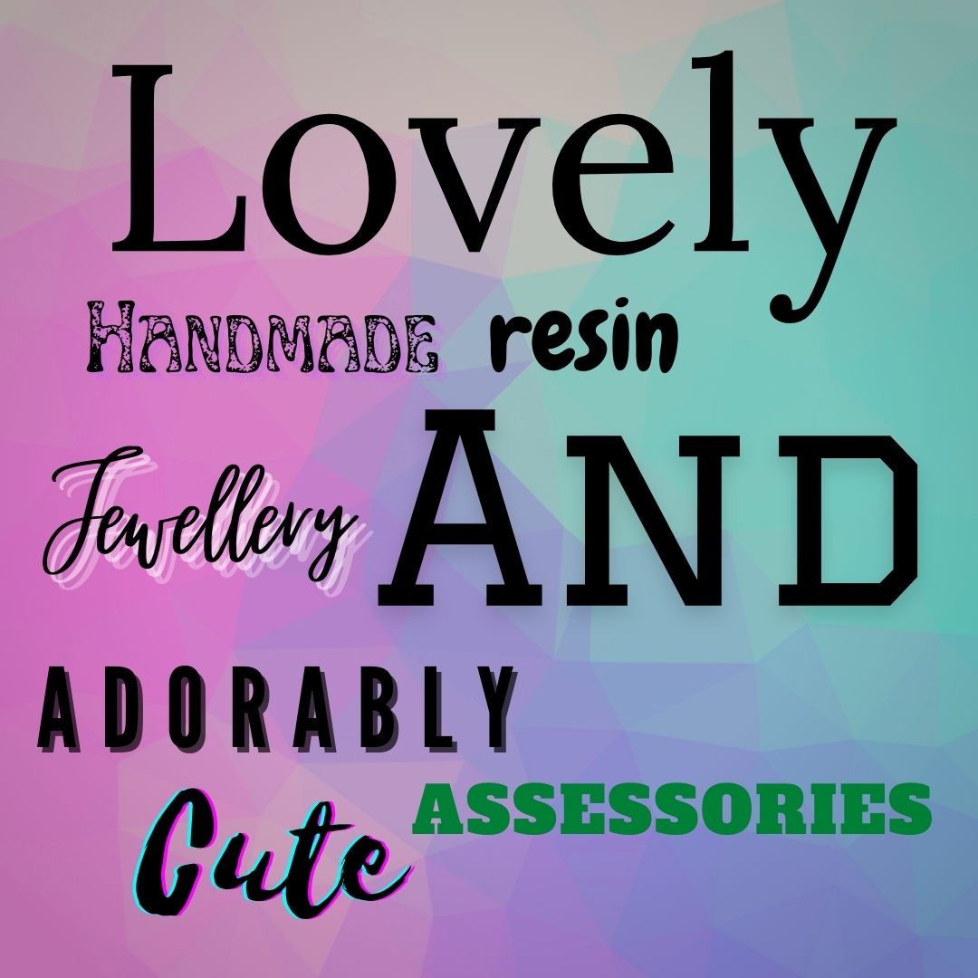
Use a maximum of 3 complimentary fonts that are in the same family (for example serif, and calibri are font families). Preferably only use 2 fonts. The brain has to adjust to each font that it reads. If something is even slightly difficult to read, people will not read it.

6. Too Many Colors
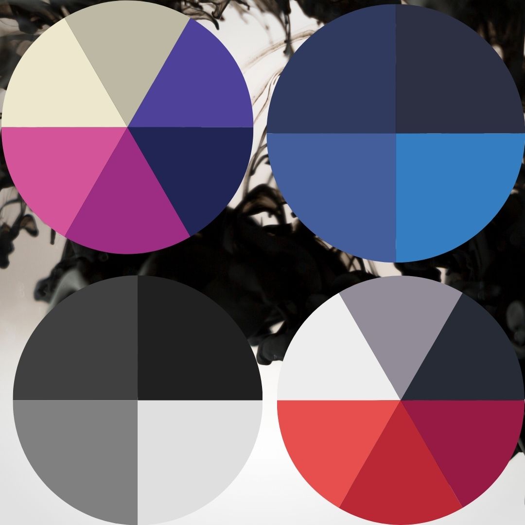
I return to the makeup example. You do not use every color possible, you use colors that complement each other. Choose a color palette that provides contrast, makes text easy to read and that is attention-grabbing. Don’t use overly saturated and bright colors as a background, they strain a person’s eyes and they will leave.
7. Not Highlighting the Important information
This happens when people ignore the visual hierarchy. Always put the most important text and visuals towards the top and make them the biggest elements of your design.

8.Ignoring how Elements Interact
Properly align the elements in your design. Don’t arbitrarily place visuals and other elements. If there is text that is referring to earrings, put a visual of earrings beside, under, or on top of that text. Do not put an image of lipstick in the area where you’ve put text talking about earrings. Make it organized.
9.Lacks Consistency
Consistency is important when it comes to branding. People need to be able to see something and know that that is or is not you. On Wesbites, entrepreneurs like to make each webpage look entirely different from each other. This is Wrong, people need to know they are on your website and that is achieved via consistency. A good way to achieve consistency is choosing a color palette and using only those colors to represent your entire brand. Use the same visual filters and fonts. This way you can make things look different, be creative, and still, your brand will have a sense of cohesiveness which creates consistency.
Related Articles:
Visual Hierarchy: https://www.interaction-design.org/literature/topics/visual-hierarchy
8 Graphic Design Mistakes to Avoid: https://www.sageworld.com/blog/index.php/2019/10/11/8-graphic-design-mistakes-to-avoid/
You need to take part in a contest for one of the highest quality sites on the net. I am going to recommend this site!
Can I simply say what a comfort to discover somebody who truly understands what they are talking about on the internet. You actually know how to bring an issue to light and make it important. More people must look at this and understand this side of your story. I was surprised that you are not more popular because you definitely possess the gift.